I thought I would do a running commentary on what I think of my new Apple Watch.

This would only be very casually formatted/edited, and I’ll just be adding to this entry as I go, so check back for more updates as I get used to my latest gadget.

Okay, so for some very quick background:

I ordered a white 42mm Apple Watch Sport with the white elastopolymer band and received it on launch day (24th April).

I’ve also swapped phones with my boyfriend (he has the iPhone 6 Plus) to see whether I can handle the bigger sized phone now that I have the watch.

Sun 26th April

  • The watch comes in very handy for me with the bigger phone. I find the phone very unwieldy and I no longer have it in a pocket but have it in my bag. As such, notifications on my watch are great, I no longer have to dig out the phone to read messages.
  • It’ll be better once there are Native Line and Whatsapp applications. But for now, I can send stickers using the Line watch interface.
  • Sending iMessages is really easy using Siri – but then I haven’t tried it in a crowd, just in the car.

  • I’ve also used the map function on the watch whilst driving which is really cool.
 When I used the maps/directions features on my phone in the car in the past, I’d turn off voice navigation because it had a tendency of talking right over the podcast or audiobook I’m usually listening to. This usually means I would sometimes miss a turn if I wasn’t concentrating.
 Now the watch taps my wrist when I’m coming up to a turn which is very convenient.
  • When at home (with wifi network) the connection between the phone and watch is extended past the Bluetooth range.
  • This means if I leave my watch upstairs, I can still receive messages and phone calls if I’m downstairs or something.

  • If you can’t find your phone, there’s a button on the watch to make the phone ping (much easier and quicker than logging into iCloud on the computer). This is extremely useful as I’m constantly misplacing my phone.

Sun 3rd May

  • Every morning I wake up and look at my calendar and the weather.
 It’s so much easier to do that on the watch (especially if you choose one of the more information intensive watch faces, or use the glances), than doing it on the phone.

  • The watch is not meant to be life-changing, I don’t expect it to be; it just makes a few everyday things more convenient.
 (And if only people I know gets it, the communications gimmicks would be pretty cool too)
  • I’m a person who would wear a smart watch and being a Apple fangirl, it just makes more sense to stay in the eco-system.
  • For some, perhaps the Watch would only be useful when native apps get added later on in the year.

This is my first typecast, so I’ll keep everything left-aligned to make it easier for me.
So already there is a typo, and the anal part of me is itching to retype the whole thing to fix it up, but that’s not the point of this exercise, is it?
I find, when typing on a typewriter – san first draft – that I have trouble thinking of something to write. More accurately, I am wary of typing anything until I have it semi-formulated in my head.
This, of course, makes sense, as you cannot delete off a typewritten page.
But at the same time I find that my mind is not used to fully forming sentences before committing them to paper; my mind is used to being allowed to see the formless ideas spewed onto the screen before going back to edit them before clicking “send” or “submit”.
I think this exercise might help my writing in some ways. Although in some ways it would force me to write slower, it may force me to think and formulate my ideas more quickly.
Reading the above entry, I could already see some sentence structure that needs improving.
And some spelling.

From my only typewriter,1 the Imperial Good Companion 1943

For a very long time, I’ve thought about getting a typewriter. Not the electric one, nor the plastic ones from the 60’s or 70’s, but the honest-to-god-all-made-of-metal-could-kill-someone-if-you-threw-it typewriters. 

Recent correspondence between my latest IGGPPC-assigned pen-friend and I got me scouring eBay and Googling for any possible candidates in my area.

My criteria were as follows (in no particular order):

  1. Portable2 not desktop version
  2. Either has local pick-up or real cheap shipping
  3. Is not plastic
  4. Looks pretty (not too banged up)
  5. Not going to burn a hole in my pocket
  6. IN WORKING ORDER (I don’t know enough about typewriters to be able to fix one up)

Of course, some of my criteria conflicted with each other:

  1. Pretty ones were not cheap
  2. Cheap ones that look pretty may not work – and getting them fixed was probably going to cost a pretty penny
  3. Pretty and cheap ones were all overseas – and the shipping would make them UN-cheap
  4. My definition of pretty is pretty subjective and expensive. Apparently, I really like the look of the Underwoods – especially their Noiseless 77, but again, not cheap

After a week of eBay deep-diving – which included a lot of frustration, as all the pretty machines were selling at ridiculously low prices overseas, but were selling for 10x the price in Australia – I managed to snap this little beauty for $80AUD.

It’s an Imperial The Good Companion typewriter and according to the internet, it’s a 1943 model. I’ve still to find where the serial number is on this thing, so if any of you out there know where I should look, please leave a comment.

I am hoping to type my future correspondences with my pen-friend on this typewriter. And maybe, I would even try a hand at typecasting!

The latest thing I’m into: a software called YNAB (You Need A Budget).

Previously I keep track of my budget with an iPhone app called iReconcile. I loved the app enough to pay a yearly subscription to get their online syncing service. That was two years ago.

But over the two years, I’ve been using the app I’ve been experiencing annoyances large and small. Sometimes the sync would corrupt my data and I would have to contact customer service to roll back my data. Which is okay, if they would only respond to my emails. I’m supposedly paying for this service after all. Lately, the app is starting to get bogged down with the sheer number of transactions and I had to clear out data before it starts moving again.

They had also advertised a web app to allow tracking and entering of data from your desktop. When I first got iReconcile this web service was next to useless and there hasn’t been any update since.

A few weeks ago I decided to email them directly to see if any updates to either the iOS or the web service were in the pipeline. No response.

That was also when my iOS app decided to cough on me again – most likely as a way of prompting me to delete old transactions (one at a time, mind you) again.

That was the end of it for me; I didn’t see the need to keep paying for non-existent customer service for an ageing app.

Google helped me discover YNAB.

It is everything iReconcile is supposed to be but wasn’t.

YNAB (You Need A Budget) is a desktop budgeting system with an iOS/Android app to facilitate tracking.

I love doing the actual budgeting on the desktop instead of fiddling with the mobile apps. Some people might want more functionality on the iOS app (the Boy certainly does, but then he’s resistant to any changes – it took months for me to get him used to iReconcile), but I highly recommend giving the system a go anyway. Being able to use the number pad on my physical keyboard just make the whole budgeting process so much quicker.

A word of note, YNAB is not like Mint.com, it doesn’t pull your transaction from your bank automatically, you have to enter your expenditure manually. I’ve been doing that with iReconcile, so this is not an issue for me, but it might be for others.

The desktop version does have an importing feature though, which allows you to manually import your transaction history (OFX file) from your bank.

This is great for finding those transactions that might have slipped the gaps and is great when you’re reconciling your accounts.

Now, what about the mobile apps?

Let me say this up front, in the YNAB system, the mobile app is used only for tracking your daily income and expenses (and your bank transfers, eg. ATM withdrawals). You can’t change your budget, and you can’t look at your reports.

But realistically, why would you want to?

The YNAB system is built around budgeting by categories instead of by accounts, which is how I’ve always budgeted but never had a system which supported it. iReconcile kind of did it, but when the budget page takes ages to load, you’re just not going to use it.

Both the desktop and mobile apps are really slick to use and pretty to look at. It uses Dropbox to sync the data between devices, and I haven’t any issues with conflicting versions of information being synced.

It’s a one-off payment of $60 for the desktop app (the mobile apps are free, but you must have the desktop app for them to work), and this one license allows you to share the software between everyone in your immediate family.

One thing I must mention is that YNAB also has a very substantial database of support filesand a comprehensive series of live classes teaching people how to budget and use the YNAB program properly. Even if you don’t buy the YNAB software, you should still go through those videos and articles; they are just chock full of tips on how to budget better.

Before I sign off, I want to point out a couple of review articles I would highly recommend reading if you want to know more about the YNAB software. I really love the apps but have only skimmed the surface of the features available. These blogs have done a fantastic job walking through each part of the program:

It’s Your Money!
Jamie Flarity

Do you budget? Are you using a budgeting program? Are you an iReconcile or YNAB user? Comment below on your budgeting experiences, I would love to know.

Recently I watched Joshua LaPorte’s video on his time mapping for 2014.

I was so inspired, I decided to do something similar but using the 30/30 app instead of an Excel file.

This is the first of a 2-part series on my system, hope you like it.

The background

As I mentioned, I recently watched LaPorte’s video:

Being the nerd that I am, I immediately opened up Excel and began mapping my own day.

I was surprised to find that, like Joshua, I only had around 2 hours a day of free time.

Obviously I’ve over-allocated some of the tasks eg. I don’t need 15 minutes to feed the cat. But over-estimating is always better than running over time.

This time map is also overly optimistic. I’ve never had any regular exercise regime and I don’t think I have been able get to bed before midnight for years.

But this really showed me why I go to bed so late; I’ve always assumed that I have more free time than I did and before I know it, it’s 3am.

For this new year, I hope to increase my sleep and exercise time by following this time map.

But I knew I wouldn’t be working with Excel. It’s too rigid; tasks are all allocated in time-specific slots and it doesn’t easily adapt to changes, eg. dinner might get rescheduled to an earlier or later time.

Introducing the 30/30 app.

The 30/30 app is a colourful little app designed by Binary Hammer.

The idea is you trick your mind into completely focusing on one task for 10 minutes, after which you reward yourself with a 2-minute break to do whatever you want.

You repeat this four more times and an hour of your work day would have passed, and four tasks would have been moved forward towards completion.

If you are a person who needs some help with getting past their procrastination, whether at work or at home, I highly recommend reading Merlin Mann’s article on this hack.

30/30 app + Time Mapping

So when looking for an alternative way of keeping track of my time map, I figured that the 30/30 app would be just what I needed.

To start, I enter in all the tasks that need to happen between when I get home from work till when I begin winding down for bed.[^I’ve [discovered](http://psychcentral.com/lib/12-ways-to-shut-off-your-brain-before-bedtime/0006577) that having a pre-sleep routine (like reading for 15 minutes in bed) helps slow my mind down, so it’s not buzzing around when I’m trying to sleep.] I don’t plan on using a time map during work; that goes into my asana task manager.

Now on the top left of the app’s display (marked by a blue frame in the screenshot), you can see how long all your task would take.

When you actually start the timer, this number on the top left turns into real time; the time it will be when all your tasks are done.

This is perfect for my time mapping, because I can see – as I complete tasks early, or delay the onset of the next task – what time my day finishes.

Since I aim to sleep at midnight, the screenshot on the left shows me I pretty much on target, as long as I follow the schedule I have left on the screen.

App Options

The app has a few options that really works to customise the way I track my time map. The screenshot on the right shows how I set up my 30/30 app.

Sounds: As the name suggests, this lets you select the type of sound for your notifications[^In the old version of 30/30 (version 2.0.1) there was an issue with the app’s notification sound being quite soft when you have the app running in the background. This issue has been fixed since version 2.1, you just need to make sure that sounds is turned on in your Settings -\> Notification Centre.].

Show Duration: This ensures the total duration of all your tasks shows up in the top left corner of the app

Show Time: This toggles the display of the start and stop time of each task still remaining on your list of to-do’s.

Auto-Pause: If this was turned off, once one task is completed, the timer for the next task would start. I usually leave this on; I rather manually start the timer for the next task, confirming that I’ve actually moved on to the next task. This keeps me accountable for whether I stay on track or not.

Auto-Loop: This is similar to auto-pause, just that if you have it off, your list would automatically restart after it’s completed all the tasks in the list. I usually keep this off.

So that’s the introduction to the system, in the following posts I would explain how I set up the time map and how I use it on a day to day basis.

If you never heard about kickstarter then I really do suggest checking them out.

Kickstarter is the world’s largest crowdfunding platform. The amount of cool gadgetry and innovative ideas there are astounding. Of course there are some projects there that can be a bit “less polished”, but if you use your common sense you’ll easily see which project is worth backing and which aren’t.

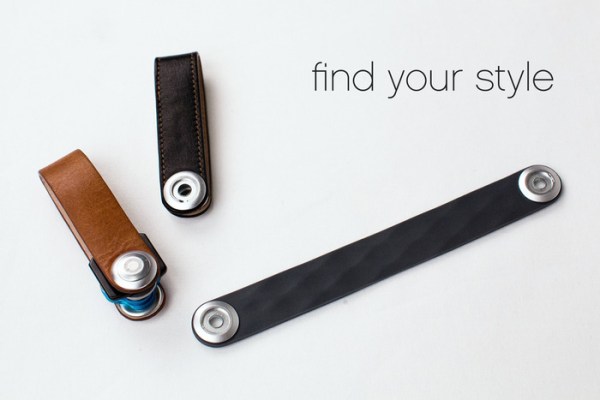
The project that I want to tell you guys about today is Orbitkey.

You wouldn’t know it, looking at the state of my room, but I like my daily carry bag to be quite neat and tidy (if only to make finding things easy). But one thing I could never really tidy up were my keys. Sure, I’ll have them on a keyring, but no matter which pocket in my bag I put them in, the keys always end up poking a hole in it. For men I’m assuming the same is true for your pants or jacket pocket.

Along comes Orbitkey.

According to their website, the Orbitkey would keep your keys organised and away from your precious smartphone screens. So no more scratched screens or wallets.

And the way they store the keys means that the keys won’t rattle either. Sure, shaking my bag is the way I can quickly determine whether my keys are in the bag in the first place. But if the keys stay in the pocket I put them in (instead of breaking a hole in the lining and swimming in the inner lining of my bag), I wouldn’t need to go deep sea diving to find them.

This project has already reached its monetary goal, so this is a definite go-ahead. There’s only 7 days to go, and for only $24 for the plastic (Active Elastomer) version or $29 for the leather, this would be a great Christmas present.

The product isn’t due to ship till March but the Orbitkey team has provided a way to print out a Christmas card letting people know that you’ve purchased an Orbitkey for them and that it would be on the way soon.

I’ve personally got one for me and one for the Boy. Can’t wait to get my hands on one.